Here we’ll be celebrating some of the best album covers ever made. We’ll give you great nuggets of information that you might not know about your favourite covers. We’ll also be looking at newer covers that may well go on to be classics.
Best Album Covers Ever
Tom Waits – Rain Dogs
A brief glance at the cover of Rain Dogs and you presume this is a vulnerable image of Tom Waits. The shirtless Waits is sunken into the upper chest of a clothed woman and you can start to think of many interpretations from coping with grief, depression, or perhaps withdrawal.
Then you look a little closer and see that it’s not Tom Waits at all. The photo is from the Swedish photographer Anders Petersen and was shot at Café Lehmitz back in the late ’60s.

Tame Impala – Currents
Created by Robert Beatty, it’s a representation of geometric diagrams which look incredible. The idea for the image was to create something that had an image of turbulent flow around an object. Plenty of ideas were put forward and the end result was one of the best-looking album covers ever.

Biffy Clyro – Puzzle
Quite a few of the songs on the “Puzzle” album are about a man who seems a little broken and that’s perfectly represented on the cover. Many of their lyrics allude to Simon Neil dealing with the death of his mother, and never more so than on “Folding Stars”.
The cover itself is beautiful but also one that shows plenty of pain. We see Neil bent over a chair with his head in his hands. His body is changed into one big jigsaw with one piece missing, which perhaps represents his mother.
Whatever the true meaning behind the cover, it’s a powerful image.

Radiohead – Hail to the Thief
Radiohead takes a unique approach of using the same designer for all of their album covers. Stanley Donwood is the man who creates them, with Hail to the Thief arguably being his best work.
The artwork was designed to mimic a roadmap of Hollywood, with most of the words on the cover coming from road advertisements. The artist wanted to take them out of context and get to the pure heart of advertising.
What we get is something visually stunning and that has plenty of hidden meaning. The album was recorded in Hollywood so it’s a good snapshot of where the band were at the time.

Blur – Parklife
Some album covers are great because they can have deep meaning, others are great because they are simply a wonderful photograph. This cover art falls into the latter category.
The picture was taken by Bob Thomas who was a sports photographer, covering many different sports. It was taken at Romford Stadium in Essex, back in 1988. Thomas was shocked that they wanted to use it for the cover and it’s unique that a band would use a ‘found’ image rather than getting one specifically made for the album.
Damon Albarn got the idea that he wanted to replicate the type of displays that used to be in William Hill betting shop windows. Their creative team looked at images from man different sports but settled on the greyhound picture, which seemed to marry up with the attitude of the band.

Pulp – Different Class
The album cover to Different Class is fairly random. You have a typical wedding shoot with cardboard cutouts of the band interspersed between them. The wedding was real and the guests had no personal connection to Pulp.
The couple were trying to save money and the groom asked his brother’s friend to take the pictures. Unfortunately, he was busy working with Pulp. About a week before the wedding, however, the couple got a phone call as Pulp wanted some photos with real people.
They worked out a deal whereby the photographer would take some genuine photos of the wedding while also putting in some cardboard cutouts for a laugh. The result was a unique cover.
While a deal was agreed, the family didn’t actually know exactly what the photos would be used for. That was until the groom’s mother was walking by a HMV and saw a poster advertising the album!
:format(jpeg):mode_rgb():quality(90)/discogs-images/R-961628-1398803175-9389.jpeg.jpg)
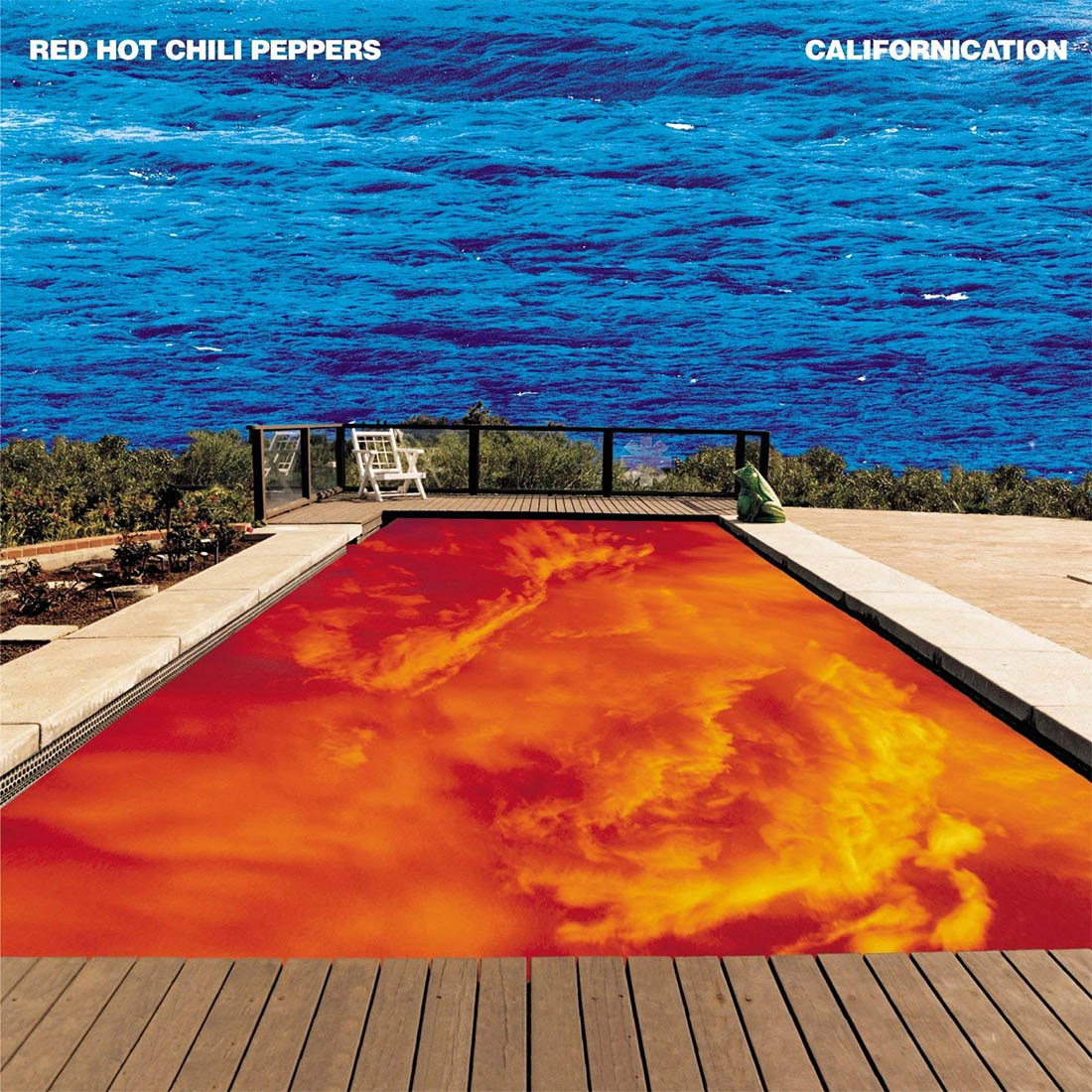
Red Hot Chili Peppers – Californication
The cover photo for Californication was taken by Sonia Koskoff and then edited by the artist Lawrence Azerrad. The idea for the cover came about because Anthony Kedis had a dream about a pool where the water was in the sky and the sky was in the water. All they needed to do was find a suitable pool to match this dream and then allow Azerrad to work his magic.
Whether it was intentional or not, the image perfectly represents the tone of the album and especially the title track. It shows how inverted the world’s view can be and how priorities can be skewed, especially in California.
Rage Against the Machine – Rage Against the Machine
The cover for this album is quite simply one of the most powerful images ever taken. it shows the self-immolation of Thích Quảng Đức. The Vietnamese Mahayana Buddhist monk took the decision to set himself on fire to protest against the persecution of Buddhists by the South Vietnamese government. The protests eventually led to a US-backed coup toppling the government.
The photograph was taken by Journalist Malcolm Browne and won the World Press Photo of the Year in 1963. It’s obvious to see why RATM would use it. It perfectly fitted their politically charged protest music. They were a band who were never afraid to shake things up and using perhaps the most shocking image of all time did just that.
![Rage Against The Machine [VINYL]: Amazon.co.uk: CDs & Vinyl](https://images-na.ssl-images-amazon.com/images/I/81BwMcjwXlL._AC_SL1200_.jpg)
Joy Division – Unknown Pleasures
The album cover for Unknown Pleasures was designed by artist Peter Saville. The image itself is from the radio waves of a pulsar which is a 1,000 light years away and was found in The Cambridge Encyclopaedia of Astronomy.
The original image showed the radio waves on a white background with black lines. Saville decided to flip the colors and the iconic cover was born. That was against the band’s wishes but thankfully he did his own thing. The result was artwork that would go on to be a cult classic.

Johnny Cash – American IV: The Man Comes Around
It was to be the last album released while he was alive. The cover gives a look of a man who knows he’s facing the end. It’s a powerful and somber cover that shows the great man in deep contemplation. The album included the legendary cover of “Hurt” along with many other covers and a couple of original songs. The record was a great final act from the ‘man in black’, and the cover reflects that.

Elvis Presley – Elvis Presley
The image on this cover is just pure rock and roll, and way ahead of its time. They say a picture paints a thousand words but you can almost hear the music through this cover. It has the passion and energy that Elvis was famous for.
It shows what the record was all about but the image went uncredited for a long time. Popsie Randolph was the only photographer credited in the album notes but he only took photos for the back cover. The actual photographer was William Robertson.
It’s a great cover and one that the Clash would go on to copy years later with London Calling.

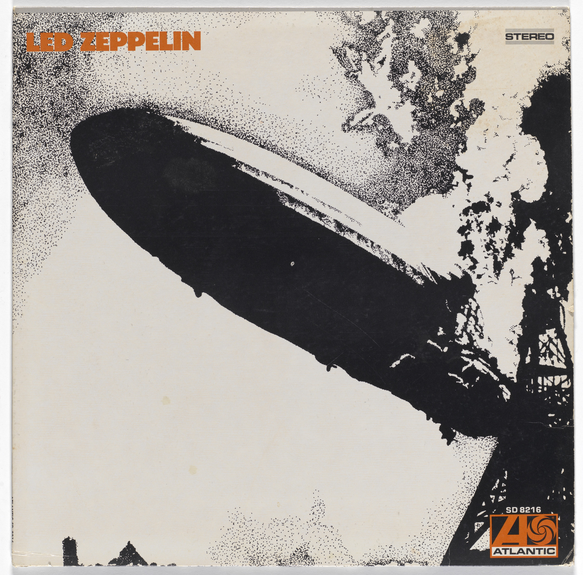
Led Zeppelin – Led Zeppelin
I don’t like albums being self-titled but this one probably fits when you have the album cover to go with it. The name ‘Led Zeppelin’ comes from the idea that, after Page wanted to form a supergroup, Keith Moon said their music would go down like a “lead balloon”. The Who’s John Entwistle replied that it would go down like a lead zeppelin! The name stuck in Page’s mind and the “New Yardbirds” changed their name due to the threat of legal action.
They dropped the ‘a’ so people wouldn’t mispronounce it as ‘leed’ and history was made, which leads us to the album cover. As you may well know, it’s an image of the Hindenburg disaster in 1937, an airship that was invented by Count Ferdinand von Zeppelin.
It was a bold choice to have an image of such as disaster but what an epic image it is. Its infamy became immortalized when a relative of von Zeppelin threatened legal action over the use of the image in 1970.
In retrospect, it perfectly encapsulated what Led Zeppelin were all about. A band that would bring chaos and musical explosion to the world. It was an album, an image and an attitude that would lay the framework for every rock band that followed.
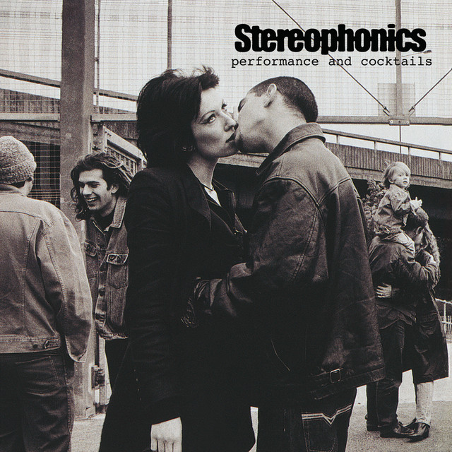
Performance and Cocktails – Stereophonics
The cover of Performance and Cocktails is a curious one with a woman looking decidedly unimpressed by a kiss she is receiving. It’s one of those photos where you can make your own interpretation. It was inspired by a similar photo by legendary photographer Annie Leibovitz, outside a prison in California.
The album cover was shot by Scarlet Page, who happens to be the daughter of Jimmy Page, the Led Zeppelin guitarist. It was shot on a football field in London and the model for the cover was Lucy Joplin, who was paid £75 for her time. Joplin went on to launch her own music career with her band Lucy’s Diary, who have released two albums in 2010 and 2015.

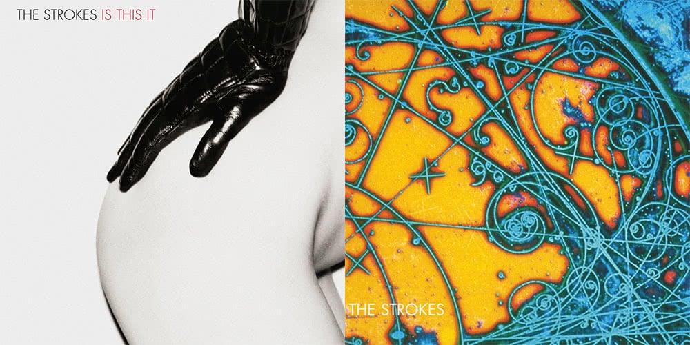
Is This It – The Strokes
This is one of the sexiest album covers ever made and it’s one that wasn’t pre-planned. The photographer was Colin Lane who decided to take some sexy shots of his then-girlfriend after she’d got out of the shower. He asked her to put on a Chanel glove that had been left behind by a stylist and took a series of different photos.
There is something charming about the image as it is risque but without being explicit. It perfectly matched the tone of the album which helped to make it even more iconic.
The picture wasn’t taken specifically for the album and was only discovered when they asked Lane if they could flick through his portfolio. While the Europeans were left with an iconic cover, the band decided to go with something less provocative for the American audience. An interesting image but nowhere near as cool as the “the ass picture”, as Julian Casablancas called it.